
REBRANDING THINGS
We loved working on this pro bono project. THINGS is a unique boutique staffed by volunteers operating since 1967. It donates all profits (in the six figures) to the Royal Winnipeg Ballet. It sells amazing finds from estates, consignors, and generous donors. From furniture to jewelry and art to dinnerware
After years of operation, the organization needed to refresh. The business had evolved but the brand had not kept up. This happens all the time in all industries, but THINGS was unique especially given its leadership and staff are volunteers. We offered to help and together, we set goals for the project.
First, was to shift perceptions. Those who knew THINGS had dated associations. Next was to grow awareness to attract new customers. It was also important to diversify the merchandise, volunteers, and customers. Lastly, a good brand drives revenue. With the goals set, together we went through a rebranding.
An enthusiastic committee drove the project. Through a series of workshops, we explored what could be. Between these meetings, the brand story, copy, and logos were developed, and all put into visual representations of what the new brand would embody and how it would appear. There was debate but never dissension. In fact, the final logo was a unanimous decision, which rarely happens.

The new brand takes THINGS from classic to cool, antique to unique. It recognizes that the boutique is not just a shop but a connector in the community and a sizeable supporter of one of city’s greatest assets, the Royal Winnipeg Ballet. Here is a summary of the brand story:
Style your home, complete that collection, be inspired. THINGS curates the incredible from estates, consignors and generous donors. We bring storied objects into modern living, helping the Royal Winnipeg Ballet soar.
And we established a primary tagline: THINGS – find what moves you. The tagline helps relate back to the ballet. Next came the logo. There were twelve options, and the chosen one is sophisticated, compelling, and elegant. It has a slight homage to Saks Fifth Avenue.
There is a bit of irreverence in the communications to attract attention. In social media, an image of a bracelet could have the copy, Champagne Taste. Soft Drink Price. A chair may be marketed with, WANTED: a loving home for a four-legged friend.
The refreshed brand has launched and with help from the Royal Winnipeg Ballet marketing team, is rolling out to make the desired shift. Holly Beard and Evelyn Mitchell are the Co-Presidents of THINGS who led the initiative. Beard shared, “Jeff very generously donated his time and considerable skills to this effort. The purpose of our rebranding was to highlight our new, more diverse business model. The new brand has generated support and excitement from our customers and motivated our members, so mission accomplished and we couldn’t be happier.”


AN IMAGE ISSUE
Given these times, Canadian restaurants have upped the Canadiana in their marketing. Especially those with American names and associations. Websites have been revamped with content to remind people of their origins and ownership. Signs, promotions and social media are seeing changes. Some efforts are token and cautionary while others are moving to passionate and proud stances.
Some Canadian chains embedded Americana in their brand when the countries were friendly, when the American brand was somewhat decipherable, and because it was cool to experience a taste of America. No Canadian restaurants with American names or associations have yet changed their name which is prudent and too knee-jerk but discussions are taking place about the best approach if the situation with America persists.
In the meantime, Canadian graphic designers are busy swapping out American red stars with maple leafs on everything from menus to uniforms. Here is how some Canadian restaurants with American aesthetics are responding.
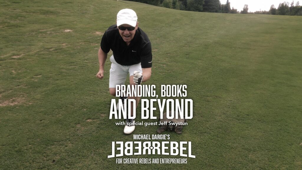
JEFF TALKS BRANDING AND WRITING ON THE REBEL REBEL PODCAST
Jeff joined host Michael Dargie on the RebelRebel Podcast. Known for his expertise in branding and marketing, Swystun shares his journey from the bustling world of Madison Avenue to becoming an acclaimed author and branding sage. He delves into his career in advertising and branding, sharing anecdotes and insights from his time on Madison Avenue.
And the episode explores Jeff’s shift from corporate life to an independent branding consultant, offering strategic insights across a variety of industries. He then talks about his books, including Why Marketing Works, and a unique exploration of the history of TV dinners, blending social and business history with culinary evolution.
The episode wraps up with Swystun discussing his future projects and aspirations in the realms of writing and branding innovation. The conversation highlights the importance of storytelling in branding, with Swystun discussing how brands connect with their audience through unique narratives.
Dargie says, ” This is a masterclass in branding, marketing, and creative expression. Jeff’s journey provides invaluable insights for anyone passionate about marrying strategy and creativity.”
YOGABABBLE: THE NARRATIVE DISGUISING OF BUSINESS
Language is fascinating. Written, spoken and designed communications are my trade so, when I happen across something new, I perk up. That occurred while listening to the WeCrashed podcast covering WeWork and CEO Adam Neuman.
One word hooked me. Yogababble. According to Urban Dictionary, it means, “Spiritual-sounding language used by companies to sell product or make their brand more compelling on an emotional level. Coined specifically about WeWork’s IPO prospectus in 2019, which was full of phrases like “elevate the world’s consciousness” and at the same time showed problematic financials. Yogababble is intended to disguise or compensate for practical or financial weaknesses in a business or product.”
Scott Galloway, marketing professor, podcaster and writer, coined the term. He once shared the stage with Neuman at a conference and was put-off by the founder’s quasi-religious turn-of-phrase. When WeWork’s US$47 billion IPO prospectus came out, Galloway poured through it. On the very first page, it stated, “Here’s to the power of We.”
The professor was unsure if the document was describing a pharmaceutical company, an exercise brand, or cult. It was written by Neuman and the design directed by his wife who had the title, Chief Brand and Impact Officer. No one at the company was really sure what responsibilities that carried and were further confused when Rebekah tended to relate everything back to her yoga training and wellness theory.
Critics pointed out that Adam, who stands 6’4”, appeared in most photographs with his arms stretched out like a mystical wonder. The prospectus mentions him 169 times when most mention their CEO’s less than 50. He is referred to only by his first name in the financial document, creating a Jesus complex that seeped.
For Galloway, yogababble in the IPO was a giant red flag. After years of doubting WeWork’s claims, his frustrations grew. Galloway also called out Peloton. That enterprise refers to itself as, “an innovation company transforming the lives of people around the world.” The professor’s response? “No. You sell exercise equipment.”
Corporate-speak has been humorous for a long time. Decades before I worked on Madison Avenue, there was the notion of, “sizzle and steak”. Your product was grilled beef, but you differentiated with a florid and fanciful description of how the meat slices like butter, melts in your mouth, and tells the world you have arrived.
Now marketers use new age terminology in non-religious and non-spiritual contexts, to convince people to buy. WeWork was a bricks and mortar business but sought the excitement, respect and valuation of a technology company that would become a religious movement.
It is hard not to doubt wannabe unicorns for, “wanting to make the world a better place”. That god-like, hollow goal permeated WeWork. Adam once spoke of solving the worldwide problem of orphans at a company retreat. His wife started a school, WeGrow, for adolescents who were to be schooled in entrepreneurship and marketing. She touted that the toddlers would be treated to “branding masterclasses”.
Galloway’s assessment went viral, prompting him to create, The Yogababble Index®. It exposes those who overpromise and underdeliver, “when firms are still searching for a viable business model, the temptation to go full yogababble gets stronger, as the truth (numbers, business model, EBITDA) needs concealer.”
Consumers expect brands to sell to them, but they are not asking to define and run their lives. Where Galloway likes to pick on Peloton, I go after Soul Cycle. Having written more brand stories than most will read, I barf a little when reading, “At Soul Cycle…we aspire to inspire. We inhale intention and exhale expectation.” That is new age snake oil. Further, I believe it irresponsible for the exercise company to state, “Addicted. Obsessed. Unnaturally attached to our bikes.”
A strong narrative is incredibly powerful. But as the professor points out, there is a thin line between vision, bullshit, and fraud. Stories sway, so they come with incredible responsibility.


THE HIGH COST OF POOR BUSINESS WRITING
I love to connect with people through writing. It is about illuminating and exploring the world without necessarily solving or resolving. Yet, when it comes to business writing, solutions are at the heart of the practice.
Josh Bernoff wrote in The Daily Beast a piece titled, Bad Writing Costs Businesses Billions. The article grabs with an amazing statistic. It seems that bad writing is costing American businesses close to $400 billion every year.
He writes, “Think about it. You start your day wading through first-draft emails from colleagues who fail to come to the point. You consume reports that don’t make clear what’s happening or what your management should do about it. The websites, marketing materials, and press releases from your suppliers are filled with jargon and meaningless superlatives.”
We spend nearly a quarter of the day reading work stuff. Much of that is wasted because of the quality. Bernoff has done the math, “American workers spend 22 percent of their work time reading; higher compensated workers read more. According to my analysis, America is spending 6 percent of total wages on time wasted attempting to get meaning out of poorly written material. Every company, every manager, every professional pays this tax, which consumes $396 billion of our national income.”
He illustrates the problem with this mind numbing job description example: “The Area Vice President, Enterprise Customers will develop and manage a sustainable strategic relationship that transforms the current commercial model by creating joint value that results in the ongoing reduction of costs, continuous process improvement, growth and profitability for both partners with the ability to export key learnings.”
Kaleigh Moore’s article in Inc., examined a related aspect. She makes the case that communication, “is an essential skill for any business”. She cites CollegeBoard, a panel established by the National Commission on Writing, “businesses are spending as much as $3.1 billion on remedial writing training annually. Of this budget, $2.9 billion was spent on current employees–not new hires” because “even a college degree doesn’t save businesses from the effects of poor writing skills.”
A report from the Partnership for 21st-Century Skills identified 26.2 percent of college students having deficient writing skills. These educated folks “also lacked proper communication skills across the board.” This should come as no surprise. Writing makes you a better reader and conversationalist. It improves presentation skills. All make for a more innovative and efficient workforce.
Carolyn O’Hara tackled this subject in Harvard Business Review. Her piece, How to Improve Your Business Writing, paraphrases Marvin Swift, “clear writing means clear thinking.” Kara Blackburn, a senior lecturer at the MIT Sloan School of Management is also quoted, “You can have all the great ideas in the world and if you can’t communicate, nobody will hear them.”
O’Hara lays out sound advice:
Think before you write: don’t start writing on the spark of an idea. Talk it through in your own mind before words flow on paper.
Be direct: make your point right up front. It will guide everything after. Prove or disprove a thesis.
Cut the fat: avoid the unnecessary and build up the necessary, not with words, with emphasis.
Avoid jargon and $10 words: Converse, don’t impress.
Read what you write: I agree and read it out loud. You will edit for greater impact.
Time off: We write every day but walk away from that book, article, blog, or report. Athletes do not train the same muscles every day.